
Logos are powerful visual elements that can give your business a unique identity in front of the target audience. A well-designed logo has the power to make customers aware of the industry a business serves along with the products and services associated with it.
Every industry has its own specifications and standards. Logos are one of the initial requirements for a business of any industry to differentiate itself from others. It is the first thing that people notice about your brand. Therefore, an important consideration for a business is the industry. A logo should be effective and unique, portraying the characteristics of an industry.
Designing the right logo for a business is the first step to success. Let’s throw light into the best ideas to develop a unique logo that hits the spot of the relevant trendy industries.
Automotive
A professional automotive logo should include design elements that depict the type of products you offer to consumers. An automotive logo should be able to communicate the style and sensibility of the brand. Most modern car brands have sleek and stylized logos.
Before you start designing a logo of the automotive industry, think about what design elements are important. Icons with wheels, tools, and wrenches, an outline of a car, or a steering wheel might come to your mind when you think about this industry.
For choosing a color for your automotive logo, take colors like red, orange, or blue, which are commonly accepted colors for the industry. Red conveys masculinity, speed, and strength. Blue stands for reliability and efficiency. You can pair these colors with tones like white, black, or gray. When it comes to choosing a font, simple and legible fonts are preferable.
Some of the examples of the automotive logo include:
Food and Beverages
Attracting customers towards a food brand needs a design that hits the target market right. Food logo design plays a major role in shaping the preferences of consumers for a particular brand. Logos in the food industry are generally inspired by taste blended with freshness, novelty, hygiene, etc.
Many food chains have logos that contain a hidden message for customers to identify and interpret. The message is not visible to the naked eyes but has an effect on the subconscious mind of the customers.
The right combination of colors should be selected before designing a food or restaurant logo. Think of colors that remind you of food like red color, which is considered as an appetite enhancer.
Food logos become effective when symbols related to eatables are used in the logo. A symbol that describes the specialty of the restaurant can be added too. There should be minimal typography and bold and colorful illustrations, blending them with the cultural context.
You can even add a friendly face in your logo that can make your brand more approachable and welcoming. One such example is Starbucks. You can even add a tagline that gives identification of the nature of the brand. For example, Subway has “Eat Fresh” tagline depicting the brand being a source of a healthy meal.
Some of the examples of food logo include:

Information Technology
Information technology logos have to be simple, whether it is a software consultancy or a computer hardware company. IT logos are generally modest, as shown in the below examples:

You should check out the logos of well-known IT companies to get an idea. Consider creating IT logo designs that haven’t been explored yet. Color use should be limited but apt. Through your logo colors, you have to convey professionalism. Blue color is quite suitable in this context.
Logo shape is also significant that affects the overall feel of the logo. Round shape will depict a sense of love or community while straight lines will convey stability and strength. Use colors, shapes, flow, and symbol in a way to avoid brand confusion.
Your logo should have the capability of being transferable to different mediums. It might have to be printed on small hardware products or even business letterheads, including web ads, social media platforms, etc. Your information technology logo should look good in monochromatic form as well as with colors.
Sports
Sports logo should be a representation of values of passion, aggression, and competitiveness. You should design a logo that is well-accepted by sports enthusiasts across all age groups.
When you are deciding the colors, the scheme you select should have a nice flow and compliment each other than distract your fans. You can have a primary logo and secondary logo too having a different color scheme with a small change in team mascot.
Your logo should even identify the sports your team is into. For a baseball team, you can use a baseball bat or a ball. For a basketball team, you can incorporate a ball or a net.
Use your logo to represent motion. You can portray motion through images, colors, lines, shadowing, etc. Use bold fonts as thin and cursive fonts aren’t visible in t-shirts or sweatshirts.
You can include mythological creature, sport gear, flag, or even animal in your logo. A Bull conveys strength, and a Leopard shows agility. You can even use fire in your sports logo, which indicates aggression, power, and the supremacy of the team.
You can include the name of the team in the logo and then graphically enhance the fonts as per the game or characteristics of the team. Utilizing a trophy or shield or final cup in your logo can also work well. Create a sports logo that depicts a story or has a meaning behind it.
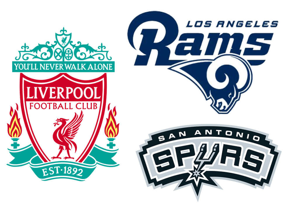
Some of the examples of sports logo include:
Travel
Your travel logo should be showcasing relaxation, thrill, and the joy of traveling. You can use the image of a vehicle in your logo as it is a symbol of movement and progress. You can even use the image of some famous landmark to grab the attention or give a glimpse of your own resort or hotel.
There are other ways too, like including a plane for long vacations or wings, ships, cars/buses, and carnival to attract the party goers. Humans/character logos work really well for travel logo. Some travel logos show people engaged in various activities like camping or hiking and some feature traveling tools like a map or a compass. You can even use greenery and trees.
You can have an image of the sea in the logo background, depicting growth and traveling. Having a beach designed, symbolizing fun and cheerfulness in the logo will give good vibes and promise customers of a great trip. You can even use roads for showing an enjoyable journey ahead. You can use a backpack as the logo symbol with a happy traveler in it.
Do not overuse images and words. Use designs, text, and colors that are bright and colorful. Green and blue are used often. You can even use lines, circles, trapezium, and other geometrical elements if you wish to design an abstract and modern logo.
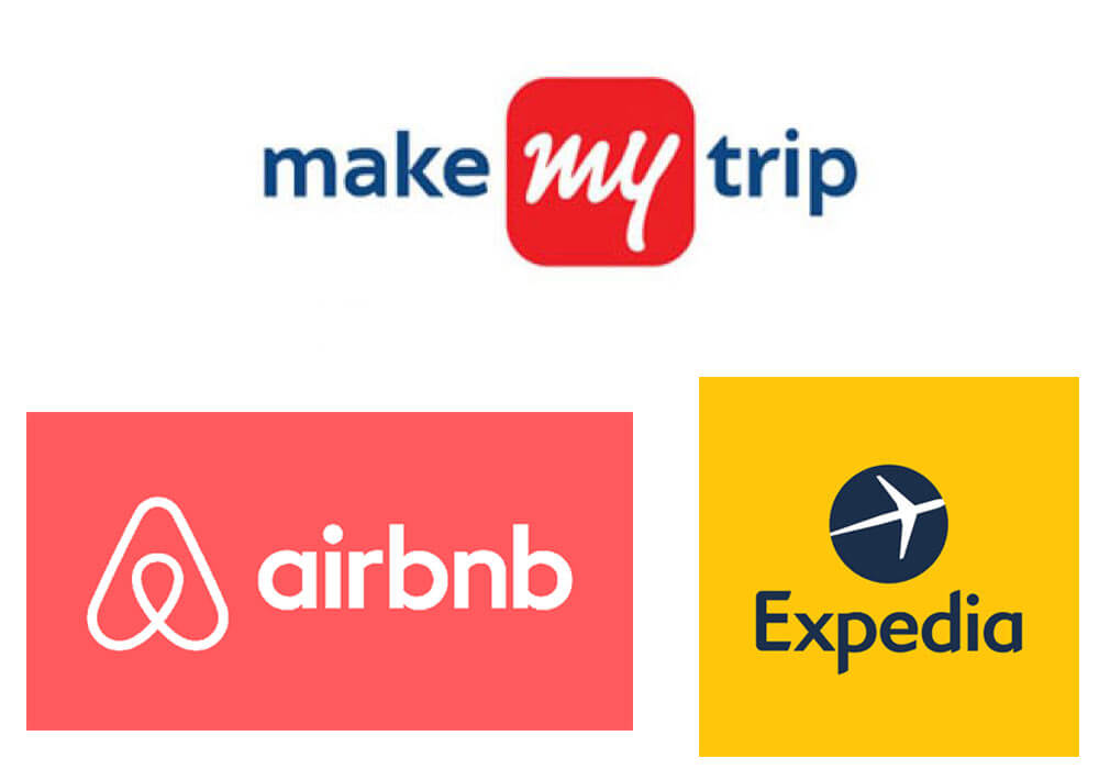
Some of the examples of travel logo include:
Clothing
Your clothing logo has to communicate your style and great taste. Through your logo, you can showcase elite clothing. You can even communicate quality, durability, and comfort through your logo. You have to consider the interests and expectations of your target audience. For example, vibrant color logos are best suited for children’s clothing brand. When designing your logo, think about the feelings your clothing brand evokes.
You can use men’s or women’s silhouettes as the icon. Animal images can be used in children’s wear. Your logo for them should convince their parents of safety and reliability. Your logo can even have accessories you are selling like gloves, or glasses, or belts. Many online clothing stores prefer to have beautiful hand-written fonts.
Use colors that can reflect your brand identity. It is better to use bright colors that can draw the attention of consumers. Warm colors such as red and yellow are uplifting and energetic. Red color depicts passion, power, energy, etc. While colors like blue and green show calmness and are more reserved.
Along with being visually attractive, the font should be easy to read across different mediums, including brochures, business cards, t-shirts, website header, etc. If you have a large icon, pick a thick font. Avoid hard-to-read fonts. Script fonts have uniform strokes. Leave enough space between the icon and the text.
Most high-end fashion logos are black, and there is a reason behind this. Black color symbolizes style and elegance. It is sophisticated and classy, depicting a sense of authority and boldness. Gucci’s logo, for example, has black color symbolizing grandeur and authenticity. It is also synonymous to luxury and sophistication.
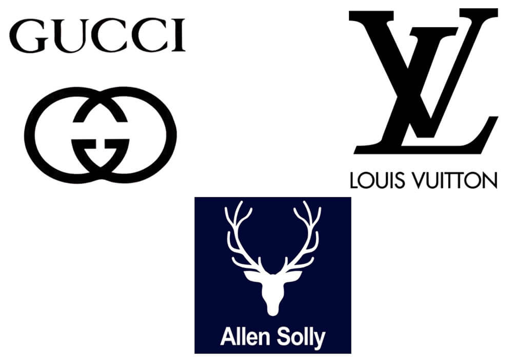
Some of the examples of clothing logo include:
Conclusion
Deciding upon the type of logo to be created for a brand is a difficult task. You have to use icons, fonts, and colors which depict the essence of your brand perfectly. With the right knowledge, a brand can create a masterpiece while conquering the top position in the industry.
When deciding on the logo for your industry, you have to consider:
- What your company represents?
- What kind of services do you offer?
- Who your target customers are?
ProDesigns has a knack for creating logos of various industries. Our designers are highly efficient and experts, designing logos of varied industries across the globe. Get in touch with us through [email protected] to get more details about our logo design services.